Districts flip, party affiliations change, and populations and geographies shift. These and other changes are visible in the project’s first release of over 70 maps visualizing county voting returns by state from the first five U.S. Congressional elections. The project will regularly release additional Congressional maps through the nineteenth Congress in early 2018.
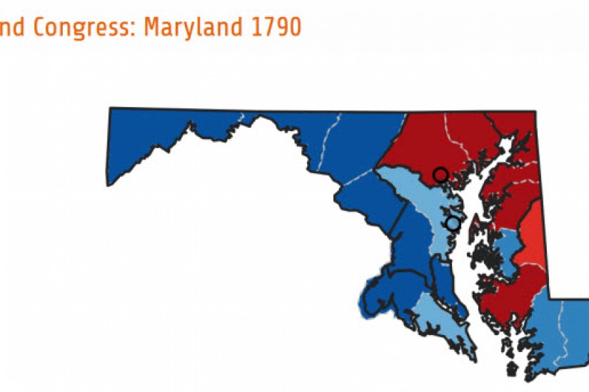
Shifting votes for parties in the first three Congressional elections in Maryland.
The new Maps section invites users to browse by Congress and state. Some states, like Maryland, saw swings in party affiliations, party competition, and regional voting patterns within the first decade of the United States. Others states, like the solidly Federalist Connecticut, did not.
Each map page reveals a state map with the results for a specific Congress, with voting districts and counties outlined that are color-coded to represent the margin of victory. For example, looking at the first election in Maryland, the state elected all Federalists (green) to Congress, even with a strong showing of support for Anti-Federalist (orange) candidates in Baltimore and Anne Arundel Counties. The darker the color, the more votes received by a party in that district. It is then possible for a user to click through to the next Congress, under “Related Maps,” to compare how voting patterns changed from election to election
Below each map, we provide a table of data that lists election returns by district (or at-large), candidate, party, vote total, percentage of votes earned. To clearly identify the winners, each elected candidate receives a check mark at the end of their row of data. There are cases when a candidate won the election, but did not serve in Congress.