A connected street is a healthier street. Neighborhoods with more short links and intersections—and fewer dead-ends and cul-de-sacs—have lower rates of obesity, diabetes, and heart disease, researchers have found. In part, that’s because they promote walking and biking.
So what does it mean that the world is growing less connected?
A new study published in the Proceedings of the National Academy of Sciences charts a worrying global shift towards more-sprawling and less-hooked-up street networks over time.
Adam Millard-Ball, a UC Santa Cruz professor of environmental studies, and Christopher Barrington-Leigh, a McGill University economist, examined 28.6 million miles of streets across every continent, using public data from OpenStreetMap as well as historic satellite imagery. They built an algorithm to identify various characteristics of connectivity, such as the number of cul-de-sacs, the length of unbroken street links, and how long it takes to walk to key destinations.
(File this under “the more you know”: There are 10,845,867 dead-ends in the world, at least mapped on OpenStreetMap.)
Combining this information to create an index for street “disconnectivity,” Millard-Ball and Barrington-Leigh then mapped it across the globe. In their interactive online Global Spawl Map, the bluer the area, the more compact its streets tend to be. The redder, the more sprawling.
Most of the patterns are what you might expect. Cities in Latin America, Japan, South Korea, much of Europe, and North Africa tend to feature more tightly connected streets, while sprawling urban and suburban areas in Southeast Asia, the United States, and the U.K. have looser grids and more cut-off segments. And because the researchers were also able to map changes over time through satellite imagery, they also found a global trend since 1975 towards disconnectivity. Right now, sprawl has migrated from American suburbs and is proliferating quickly in Southeast Asia, India, and other parts of the developing world.
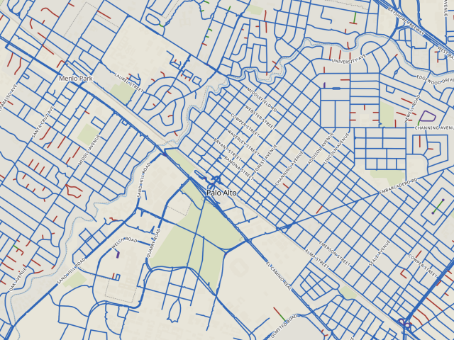
A tool within the map allows users to zoom in on towns and cities with various kinds of street networks, and trace how these networks have grown since 1975. Here’s an example of a largely connected grid: downtown Palo Alto, California, which has only a handful of dead-ending streets (in red).
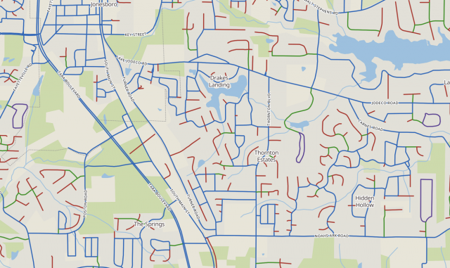
And here’s a newer suburb outside Atlanta, which abounds with disconnection. The green routes indicate only-way-in streets.