My understanding of how this graphic came to be in the paper remains skeletal. I haven’t found any correspondence that mentions it among the papers of the Tribune’s editors. It seems likely that publishing an exotic illustration like this chart would have been a gambit to sell more papers to a populace with an interest in understanding the spread of the disease.
But there is evidence that the reasons to publish it were more personal. The disease hit the Tribune’s famous editor, Horace Greeley, at home. His son Arthur, called “Pickie,” contracted cholera and died in the middle of that summer at age five, “being ill only from one [a.m.] to five o’clock [p.m.].”
Although graphical displays of data were not unheard of in scholarly and engineering books, they were exceedingly rare in U.S. newspapers of that time. Maps became common during the U.S. Civil War in the 1860s, but in the 1840s, illustrations of any kind (let alone data visualization) were rare.
I’ve spent the past few years studying the history of data visualization in news. I have seen hundreds of examples of data displays in antique newspapers. Few have struck me as much as the cholera chart has. It is rare almost to the point of anachronism. There are a few reasons why.
First, the technology to reproduce such things was still primitive. Newspapers were typeset by hand, letter by letter. Illustrations and line art had to be carved by hand into small wooden blocks. Bigger illustrations were made by bolting several blocks together (if you look at the cholera chart closely, you can see some of the seams between the blocks). The process was laborious and hard to pull off on the daily deadline of a newspaper. It took great skill and there were only a handful of craftsmen who could do the work. Few if any newspapers had on-staff engravers, so it’s likely the Tribune would have had to bring in somebody with rare skills who could command a high fee.
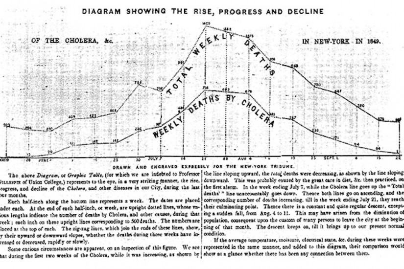
The work also had to be done quickly. The chart includes data from a week before it was published.
A bigger obstacle than the production difficulties was the Tribune’s readers themselves. It is unlikely that everyday New Yorkers in the 1840s would have been familiar with statistical graphics, and they likely wouldn’t have had any idea how to read or interpret them.


